Showing posts with label Exhibition. Show all posts

Wednesday, 28 August 2024

Review by Rebecca Reynolds of "Write Cut Rewrite" Exhibition at the Weston Library


"Kill your darlings," enjoined Stephen King, talking of the need for writers to cut words which may have taken hours to develop. This exhibition of writers' editing processes at the Bodleian's Weston Library gives evidence of such murder through manuscripts, jottings and notebooks.

So what "darlings" do we see here? Opening the exhibition is a twelfth-century manuscript, The Ormulum, commenting on the Bible in early English. This is a literal cut and paste – one page trimmed to a third of its size, overlying another with almost every line heavily scored through. "For a notebook which is almost a thousand years old it looks surprisingly modern because it features so many crossed-out passages," says the label.

Yet why do crossed-out passages look more modern than the finished product? Because they show a common human impulse to revise, with its hesitancy and changes of mind, in a way that the fixed final text does not? Doodles in Shelley's notebook, displayed here, also seem strangely modern. Perhaps it is use of the pen rather than fixed type which makes them seem more human?

Also included are three wonderful sheets of witty lines kept in reserve by Raymond Chandler for his detective novels, marked off in pencil after being used. Unused was "I left her with her virtue intact, but it was a struggle. She nearly won."

Editing materials are important. Unlined notebooks allow Alice Oswald to do the swirling coloured sketches which she then tries to translate into words. Le Carré‘s drafts are handwritten, then typed up, then the typescript is cut up again and stapled between further handwritten parts.

Sometimes little is edited – Alexander Pope’s Essay on Criticism has one large manuscript page with just one correction. Were the robust rhyming couplets a confident guide, so little revision was needed?

And what of today’s untraceable electronic editing? A digital display shows "Cuttings," a poem by Fanny Choi, where one can track the electronic editing process – "every keystroke, every pause, every typo, every half-developed idea later abandoned." This is a fascinating exhibition with an excellent mixture of writers.

Write Cut Rewrite is at the Weston Library, Oxford, until 5 January 2025.


Photo by Ian Wallman


About the reviewer
Rebecca Reynolds has worked as an English Language teacher and as a museum educator at the Victoria & Albert Museum and Reading University museums. She completed a Research Masters in Literature at Liverpool University in 2023 and is considering undertaking a PhD in either Literature or Creative Writing. She blogs here.

Wednesday, 22 May 2024

Review by Tracey Foster of "Unravel: The Power and Politics of Textiles in Art": Exhibition at the Barbican


Textiles are vital to our lives. We are swaddled in them when we’re born, we wrap our bodies in them every day and we’re shrouded in them when we die.*

The symbiosis of text and textiles is as old as mankind itself. The allegorical text of storytelling draws from man's skill to clothe himself: the weaving of a plot, fabricating a narrative and the thread of a story, draw from fireside tales passed on while sewing and mending garments. Our ability to create both fabrics and fantasies has enabled us to record our stories in word and weaving. The current exhibition at the Barbican, Unravel: The Power and Politics of Textiles and Art, has curated a vast range of examples from different cultures and viewpoints that explore the ability of fabrics to record our narrative through touch. 

Entangled in a textile are the knowledge systems of Indigenous people, who for centuries have used thread as a means for communication - to share information, to tell stories and express themselves.

A single dyed thread of indigo cotton expresses a multitude of connotations - of empire, colonial ruling and enslaved peoples - and at one point was said to be in equal in value to the people who slaved to produce it. Textile artists have explored this tale by deconstructing dyed garments to their constituent parts and remodelling them into exhibition pieces, using stitch, applique and embellishments. The artist's mark making, like words layered upon the cloth, trace the tale of our recent histories. Stitching through time has been a subversive act, a mostly female occupation, and seen as the default setting for the demure, domestic members of the household. Young girls were taught needle work from the age of five and expected to learn contrition by being silently contemplative. The bent female head was often portrayed in paintings and tapestries throughout early periods. These females learnt to bend the rules even whilst being compliant - for example, by depicting midwives at the nativity scene despite their presence being banned by the ruling church. Defiance in diligence became a way for them to express themselves, using the power of the needle when the pen was denied to them. This act has transcended ages and has seen modern textile artists continue to express emotions and defy conservative views through fabrics.

Stitching can be a subversive act: thread can work as a language to challenge fixed ideas and voice free expressions.

Tracey Emin’s quilt, No chance, allowed her to voice her feelings as a thirteen-year-old girl in 1977, the year she was raped. Old blankets and clothing were used to express these emotions and combine home comforts with the raw truth of her experiences; the decision to pick out the powerful text in a homely blanket stitch conveys the duality of safety and violation. 

For Judy Chicago’s Birth tear/tear embroidery, she collaborated with over 150 women to share birth experiences of the mythical, the celebratory and the painful to create a visceral response to the iconoclastic images of the virgin birth. Her method of using nine needles at a time each with three threads emulates the numerical symbolism of the holy trinity and the stitching following painful childbirth. 

T. Vinoja’s Border and Bunker explores her experiences of the Sri Lankan Civil War, creating aerial maps informed by her own memories and the testimonies of others. Stitches and salvaged textiles form borders, excavation routes, tents, checkpoints, bunkers and burial sites. During the war, she and her father used clothes to craft bunkers and temporary shelters by filling used saris with earth. She has spoken of the individual stitches as reparative sutures, emulating how fabric was used as first-aid to wrap and cover wounds.

Textiles are part of our everyday routines — they are in close contact with our bodies and our homes, they are used, felt, touched and seen. As such, the material is invested with personal narratives, making it uniquely suited to communicate the intricacies and complexities of lived experience.

Not all the contributors to the exhibition are female as men also turn to fabrics to explore their feelings and express their frustrations of conforming to male stereotypes. They use a perceived feminine artform to play with expectations and social narratives.

Women, men and nonbinary artists have both resisted and reclaimed these limiting approaches to the medium, questioning gendered and value-based binaries and using the act of stitching as a radical practice.

Jeffery Gibson drew from his Choctaw-Cherokee heritage and traditional powwow ceremonies, particularly those worn by the Northern Paiute people as spiritual protection in the pacifist Ghost Dance movement, in order to explore his identity as gay man. He plays with the nonbinary gender roles found in many indigenous cultures and his garments are deliberately ungendered.

Politics and art have always been unique companions; this is demonstrated nowhere more simply than the blank wall gaps where artist work has been withdrawn because of the current war in Gaza. Exhibition, explanation and discussion have always been the point of creative artwork, to open dialogue and demand a further look at the intended focus. This exhibition allows a dialogue to be created across cultures, genders, stereotypes and societal norms. Long may the thread be an advocate for communication and understanding. Long may we see more artists using textiles to tell their individual stories.


*Italicised quotations are taken from the exhibition catalogue.


About the reviewer
Tracey Foster started off in a long career as an Art and Design teacher but wanted to refocus her creative energies into writing poetry and prose. She finds inspiration in the past and the events that shape us. Previous work has been published by Comma Press, Ayaskala, Alternateroute, Fish Barrel Review, Mausoleum Press, Bus Poetry Magazine, Wayward Literature, Zine magazine and The Arts Council and she writes her own blog, Small SublimeHer work is currently on exhibition at the Ikon Gallery


Tuesday, 1 August 2023

Review by Tracey Foster of "Punk: Rage and Revolution," Leicester Museums and Art Galleries


The current exhibition at Leicester museums and art galleries explores the brief but electrifying period that encompasses the explosion of the punk scene in the UK, with a particular focus on the key movers with connections to Leicester.

On the cusp of being a teenager in 1977, I can clearly remember the shockwaves that followed the death of Elvis Presley and the furore in the news around the end of Rock and Roll. My weekly dose of culture fix watching Top of the Pops showed how torn the nation was, balanced on a record needle between the worlds of disco, cheesy pop, prog rock and punk. The last was a gut reaction against the rest, a rebellion against the norm, the staid and static. Punk was born out of a resistance to the establishment who had screwed up the prospects for its youth, with high unemployment, nationwide strikes, violence in Northern Ireland and financial crashes. This period was epitomised by power strikes and the darkness that we were plunged into. Stuck at home, freezing by candlelight, the time was right for anarchy in the UK.

This exhibition cleverly plunges us back into those times using audio, video and many newspaper clippings. We are transported back to that period to understand the rage and rebellion that emerged from it. Many artefacts have survived from the period and are displayed in conjunction with dialogue that enhances the narrative and brings us the personal. Local voices have contributed to the displays and loaned their own histories to the sets, reliving the period and effect on the city at that time. 


For me, it took me back to my youth and gave clarity to it. Younger visitors may begin to see connections to today and understand the need to have a voice, to make yourself heard. A lack of technology and interconnectivity did not stop the word from spreading in the 70s. Fanzines and press releases made sure that youth culture connected and prospered. Leicester’s scene is fondly remembered and extolled: pubs like The Hind, Princess Charlotte and the Globe welcomed the punks and well-known bands from The Jam, The Clash, The Dammed played at Leicester venues. Creatives from Leicester went on to be involved in the punk fashion scene in London and become the recorders of the time, photographers, photojournalists and movie makers - highly influential names such as David Parkinson, Stephane Raynor, Helen Robinson and Roger K Burton to name a few. Their part in the movement and lasting influences are given credit and much-needed respect from the city that spawned them.


The one element that personally resonated with me was the highlighting of the female voice. Fearless and provocative, Punk set out to empower women in a time of masculine dominance. Girls deliberately set out to create a narrative around ‘what a woman was,’ a rebellion against the male gaze and objectification of the female form that dominated the media and removed our voice. They created band names to deliberately reclaim the gross disrespect for the female body, such as The Slits, Penetration and the Adverts. The Feminist movement started around the same time, but punks became the face of anarchy, a middle finger to the establishment and conformity.  


The 70s was also a period of race riots and the rise of the national front movement. This exhibition also seeks to make connections to the reggae music and collaborations that formed at that time, black and white finding themselves outcast from society and reacting to racism together. Bands like Aswad, UB40 and Steel Pulse found themselves speaking out about injustice and intolerance, and found unity with punks who identified with their message. Bands who covered work from The Clash to The Police led to a resurgence in the Ska movement and united disenfranchised youth further. 

This exhibition is exhaustive and timely, looking back at a period of unrest and  unrivalled creativity that might spark others to reflect upon our current predicament and react accordingly. We can only hope. Rosie Ann Boxall of Soft Touch Arts says: "What excites me most about the exhibition is the conversations that have taken place between the generations. Hopefully we've created an environment where people feel that they can talk to each other.

The exhibition is on at the New Walk Museum and the Soft Touch Arts Centre until 3rd September. A summer programme of events to celebrate this exhibition is planned across August including a Punk Festival Weekender at the O2 Academy. For more info about this exhibition and any other events please follow the link to the website for further videos, interviews, playlist and catalogue bookstore here.


About the reviewer
Tracey Foster was too young to be a punk but has set store by its reactive stance ever since and would like to think herself a rebel at heart. She started off in a long career as an Art and Design teacher but wanted to refocus her creative energies into writing poetry and prose. After helping others find inspiration in the world around us, she took an MA course in Creative Writing at Leicester University and has not looked back. She finds inspiration in the past and the events that shape us. Previous work has been published by CommaPress, Ayaskala, Alternateroute, Fish Barrel Review, Mausoleum Press, Bus Poetry Magazine, Wayward Literature and The Arts Council and she writes on her own blog site The Small Sublime found here.


Friday, 2 June 2023

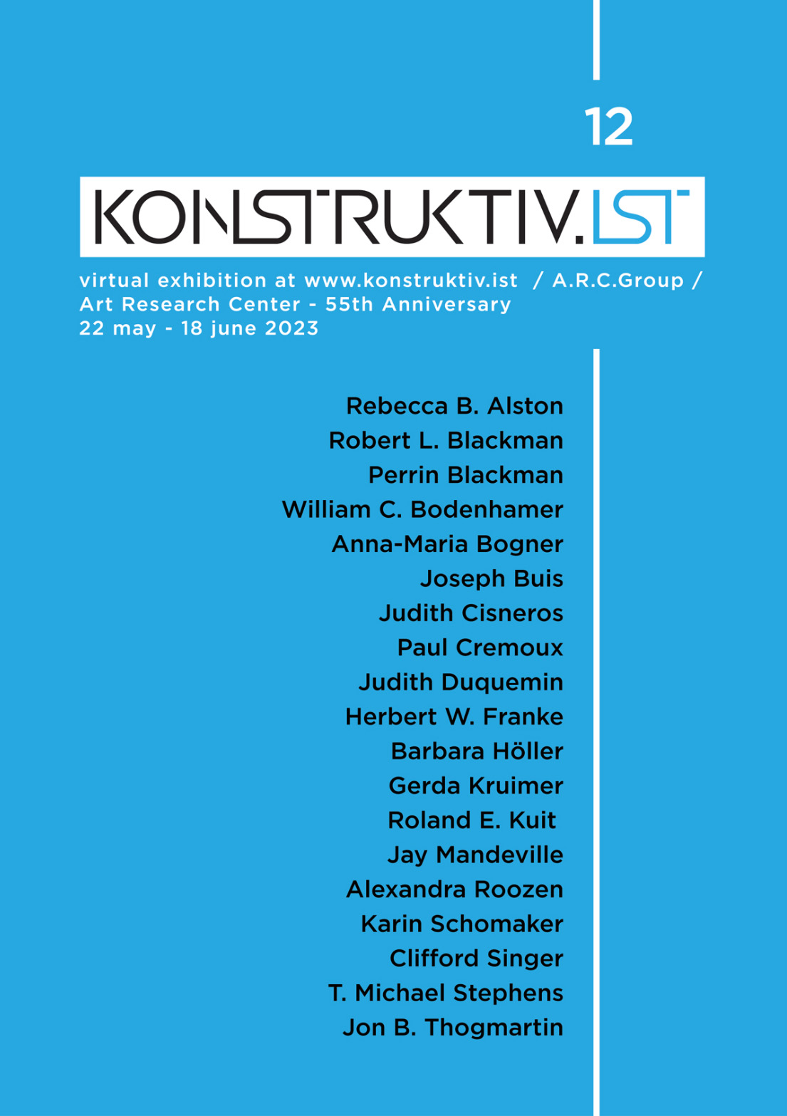
Review by Robert Richardson of "Virtual Exhibition No. 12: Art Research Center/A.R.C. Group 55th Anniversary Exhibition," 22 May - 18 June 2023


For a visual arts group to be in existence for fifty-five years is itself an achievement, and this is celebrated by the Art Research Center/A.R.C. Group with a superb online exhibition, which also becomes ‘Virtual Exhibition No. 12’ on the konstruktiv.ist website. In contrast, this website, founded by the Turkish artist Erdem Küçükköroğlu, began recently, in 2020, at the outset of the pandemic and its subsequent lockdowns, which hastened a greater movement towards online exhibitions.

The artworks of these nineteen A.R.C. members give a continuing vitality to Constructivism in the 21st century, and they are entirely suitable for viewing on screens. Constructivist art has never much depended on the relief qualities of paint, with a flat surface often being the aim (it is significant that many of the painters here use acrylic). This means when they are scanned and become digital, nothing much, in this respect, is lost, and, for the most part, an emphasis on bold compositions and colours means a screen becomes an excellent alternative canvas, with its light providing vibrancy.

Within the general adherence to Constructivism, this selection has a pleasing eclecticism: the dangers of being monolithic or didactic are avoided. As well as the adept curating of T. Michael Stephens, A.R.C. Founder and Constructivist artist and designer, and Erdem Küçükköroğlu, this is probably also helped by the other interests of the participants: in addition to 2D and 3D art, these include architecture, digital art, photography, poetry, collage, and sonic art. There is for sure a range of perceptual intelligence present in this exhibition. 

I am assuming the artists themselves nominated their descriptions on the virtual labels, and, in particular, find interesting that the German artist Anna-Maria Bogner chooses ‘Concrete Artist.’ This is of course a direct link back to the great Max Bill, the important school of design at Ulm, and the even more important Bauhaus. Although Constructivism originated in Russia, it was made truly international by the Bauhaus, not least because of its own diaspora, including Gropius and other leading figures moving to the United States. The A.R.C. group was founded in Kansas City, but the participants of this exhibition reflect this internationalism, coming from a number of counties: Argentina, Australia, Austria, France, Germany, Netherlands and USA.

A more common self-descriptor is ‘Systematic Painter (or Artist)’ and variants of ‘Structural.’ I am taking this to mean these artists are working with a system that is possibly adopted or of their own invention. One artist, Clifford Singer, is a mathematician, and I assume this informs his approach. What unifies is engagement with the basic Constructivist vocabulary of shape, line, colour and space. The creating of compositions in a systematic way is a sublimation of the individual in favour of the universal. Nevertheless devising (or choosing) a system and the aesthetic judgement on whether to accept or reject its outcomes means, paradoxically, that styles emerge. From encountering their art on social media, I now instantly recognise Judith Duquemin‘s own brand of using white space as an active compositional element, Joseph Buis’ scaffoldings of colour and T. Michael Stephens’  singular approach to working with constructions.

A more inclusive Constructivism overlaps with other Movements, particularly Minimalism, as with Rebecca B. Alston’s FDP RED #3 (2023). It consists of three squares: a small black one within a light red one, and both within the largest one, itself divided in halves of two darker shades of red. It is inevitable that Albers is referenced (and, for me, aspects of Enrico Castellani come to mind as well). The division of the largest square, offset against the other elements, creates a perceptual dimension all its own, and the fierce reds belie an accompanying meditative quality. Similarly, Jon B. Thogmartin’s Purple Dots & Yellow Circles (2022) is both Constructivist and Minimalist, with an emphatic rhythmic repetition.

There is of course much work that meets the Constructivism of lines, shapes and the geometric angles they make, and examples of exhibits that are “classically” Constructivist are Barbara Höller’s painting 19copy07 (2021) and William C. Bodenhamer’s assemblage Construct Aesthetics Inherent (n.d.).

The konstruktiv.ist website is an effective pairing for this exhibition, and should be congratulated for creating an online environment with admirable clarity of navigation, presentation and labelling, and congratulations to Art Research Center/A.R.C. Group for showing a Constructivism that continues to look fresh. The dates of the artworks are recent, and this highlights the group is not a tedious custodian of Constructivist purity but contemporary artists adding their own perceptions and ideas.

The full list of artists is as follows: Rebecca B. Alston, Robert L. Blackman, Perrin Blackman, William C. Bodenhamer, Anna-Maria Bogner, Joseph Buis, Judith Cisneros, Paul Cremoux, Judith Duquemin, Herbert W. Franke, Barbara Höller, Gerda Kruimer, Roland E. Kuit, Jay Mandeville, Alexandra Roozen, Karin Schomaker, Clifford Singer, T. Michael Stephens, Jon B. Thogmartin. The link to the exhibition (ending 18 June) is hereThe link to the A.R.C. website is here.


About the reviewer
Robert Richardson is a visual artist, writer and lecturer. His work published by Leeds Postcards in the 1980s was distributed throughout Britain, and is now in graphic art collections of the British Museum and the Australian National Gallery. It is also included in Artists’ Postcards: A Compendium (Reaktion Books, London) and Leeds Postcards (Four Corners Books, London). In recent years he has put together an ongoing portfolio of abstract digital artworks, producing some as limited edition prints and others as NFTs. In 2022, a video artwork was selected for Digital Art Month Paris, and was viewed at various public spaces in the city. He is also the co-editor of Homage to Imagism (AMS Press, New York). His website is here.   

Monday, 21 October 2019

Review by Robert Richardson of "Into the Night: Cabarets and Clubs in Modern Art" exhibition at the Barbican Centre, London, 4 October 2019 - 19 January 2020

Rudolf Schlichter Damenkneipe, Women's Club, 1925 


This Barbican exhibition ranges over both time and space: from the 1880s to the late 1960s, and includes diverse locations. While it is predictable that capital cities such as London and Rome are present, there are some welcome and revelatory surprises with the Ibadan and Osogbo Mbari Clubs in early 1960s Nigeria, and, later that decade, the Rasht 29 Club in Tehran.

Clubs and Cabarets offered a format for bringing together different art forms, and on show is an enjoyable mix of dance, performance, music, film, and poetry. In 1880s/90s Paris, the Chat Noir also presented shadow theatre, notably by the artist Henri Rivière, and the Barbican majestically displays his intricately cut zinc silhouettes and their accompanying shadows.

The exhibition includes examples of where environment itself was an active art form: the decor and furniture creating a desired aesthetic. The Cabaret Fledermaus in Vienna reflected both the Art Nouveau of the Vienna Secession and Expressionism, movements that occurred during the period of its existence, 1907-13. In one of the spaces, there is a reconstruction of the Cabaret Fledermaus’s Secessionist tiling, and the result is a vibrant visual stimulation.

On occasions there were aspirations towards “the total work of art,” as with Theo van Doesburg at L’Aubette in 1928. For the interior design, he brought to Strasbourg the influence of the Dutch De Stijl movement and exuberantly announced “the beginning of a new era in art.” He promoted  “Ciné-Dancing” by merging dancehall and cinema, and the disorienting effects might be seen as prefiguring the immersive experiences of Virtual Reality produced by today’s digital technology. 

In 1916, Dada at the Cabaret Voltaire in Zurich was not about meticulously constructing an aesthetic, but an avant-garde opposition to cultural conservatism. The insanities of the First World War surrounding neutral Switzerland were met with anarchic absurdities and provocations. The photographs of a soulful Emmy Hennings with one of her puppets and Hugo Ball in his ridiculous looking bishop’s costume are important documents, while the experimental poem taking up an entire gallery wall emphasises Dada’s stretching of language to the borders of incoherence. The curator, Florence Ostende, also made a good decision to include a monitor showing a 1967 film reconstructing a sample of Cabaret Voltaire performances. It was made while they were still within living memory by Marcel Janco, someone who participated in those extraordinary events that lasted just a few months but have a continuing influence.

The aftermath of the war led to the more focused and biting political satire in the cabarets of 1920s Berlin, with women artists, including Dadaist Hannah Höch, playing a leading part. In this section, the film of the expressionist performer Valeska Gert is remarkable. She used the movement of her body and a psychological intensity to identify with those marginalised by society, and was later to comment “Because I didn’t like solid citizens, I danced those whom they despised - whores,  procuresses, down-and-outers, and degenerates.”

The series of discrete spaces that make up the upstairs galleries of the Barbican’s exhibition area are not conducive to a flowing display, but they are usually programmed in ways that play to their strength. They are ideal for this exhibition, since each space can be dedicated to a particular place. This collaboration with the Belvedere, Vienna (where it will be showing in 2020) is impressively researched, and gives recognition to some of the lesser known figures who designed the posters and ephemera for an often edgy art and culture that brought celebration and imagination to the hours of darkness.


About the reviewer
Robert Richardson is a visual artist and writer. His work is included in Artists’ Postcards: A Compendium (Reaktion Books, London) and Leeds Postcards (Four Corners Books, London). He has graphic artworks in collections of the British Museum and the Australian National Gallery. In 2018, he had a solo exhibition of photographs, Luz Brilhante, at the Museu Municipal, one of the leading museums in Faro, Portugal. He is also the co-editor, with William Pratt, of Homage to Imagism (AMS Press, New York).
www.bobzlenz.com

Tuesday, 20 November 2018

Review by Robert Richardson of "Anni Albers" Exhibition at Tate Modern, London, 11 October 2018 - 27 January 2019


Tate Modern’s Anni Albers exhibition ends in 2019, and in so doing helps mark the centenary of Walter Gropius’s founding of the Bauhaus in Weimar. There will be celebratory events throughout the world for the twentieth century’s most famous and influential design school, and in Germany two new Bauhaus museums will open.

Anni Albers became a Bauhaus student in 1922 and was head of its weaving workshop for the couple of years preceding the Bauhaus’s closure by the Nazis in 1933. For those interested in the Bauhaus, she has long been a member of its pantheon, but having this solo exhibition at one of the world’s leading art museums justifiably establishes her with a wider audience. Strictly speaking, re-establishes, as she was the first textile artist to have a solo show at MOMA, New York in 1949.  She died in 1994, and the Tate Modern exhibition is a survey of her entire career as a designer and artist.

After completing the Bauhaus preliminary course, Albers wanted to enrol in the glass workshop, but, as with almost all female students (Marianne Brandt being a notable exception), she was channelled into weaving, in what became known as the “Women’s Workshop.” The Bauhaus was generally liberal and progressive, but this denial of equal opportunities to female students has been the subject of strong criticism.

Albers became committed to turning the traditional craft of weaving into a Modernist artform. She was the epitome of a Bauhaus artist/designer: her work consistent with the Bauhaus’s ethos, practices and Constructivist aesthetic. The workshop approach meant an understanding of materials through experiment and imagination. The exhibition shows a sample (and historical photograph) of her diploma piece: a wall covering produced for a trade union auditorium. The black and white threads were interwoven with cellophane, giving a vibrant, shimmering effect. She attended Paul Klee’s colour theory classes (a page of her notes is exhibited) and her sensitivity to colour is present throughout the exhibition. A palette of greys, blacks, whites and yellows is quiet and subtle, but when she restricts herself to red threads, there is a blaze of fierce intensity.  

Born in 1899 as Annelise Else Frieda Fleischmann, in 1925 she married Josef Albers, destined for fame as painter, colour theorist and teacher. He was a fellow student and later a junior Bauhaus Master. Together, soon after the Bauhaus was shut down, they crossed the Atlantic to rural North Carolina, where both took up teaching posts at the recently formed Black Mountain College, participating in a second legendary teaching institution for the arts. It was here, in the thirties and forties, that Anni Albers began a weaving workshop, using Bauhaus methods with her students, some of whose precise visual and written notes are displayed: meticulousness seems to be an example weavers set for us all.

Anni and Josef Albers made a number of visits to Central and South America, and the pre-Columbian weaving of Peru profoundly influenced her. This culture never had a written language, and weaving was a form of communication. I found this a fascinating section of the exhibition, and a work such as Red Meander (1954) has a wonderful, seemingly ancient, maze-like quality.


In the 1950s, after moving to Connecticut when Josef Albers was appointed a professor at Yale, she increasingly used her craft as a medium for fine art, calling these works ‘Pictorial Weavings.’ Are they equivalent to the best non-figurative Modernist paintings? On the evidence of this exhibition, I think the answer is a resounding yes. This was a personal project and there are entertaining pieces where rickety grids are subverted by threads that intervene like sparks. During this time, she also continued as a designer, and did not forget the Bauhaus position of using industrial processes to make good design available to more than the moneyed few. The exhibition shows her designs for the Knoll Textile Department, and they are still in production today. The Bauhaus idea of architecture as a unifier for all arts and crafts was adhered to when Gropius commissioned her to design textiles for the accommodation part of the Law School building he designed for Harvard. On display is a bed with an Anni Albers bedspread that helped a lucky student stay warm in an aesthetic and art-historical way.

In the early 1960s, weaving became too physically demanding for Albers, and she switched to printmaking. The exhibits include her use of an embossing technique to produce white on white prints: small reliefs that deserve recognition as well executed Minimalist artworks. 

The exhibition has clarity in its organisation and exhibition text, and a good balance between artworks and documentation: e.g. notebooks and photographs. It comprehensively shows Anni Albers’s work has an important place in a visual culture affirming the Bauhaus precept of design closing the gap between art and daily life.


About the reviewer
Robert Richardson is a visual artist and writer living in Leicestershire. His work is included in Artists’ Postcards: A Compendium (Reaktion Books, London) and Leeds Postcards (Four Corners Books, London). He recently had a solo exhibition of photographs at the Museu Municipal in Faro, Portugal, and is a member of the Biennale Austria association of contemporary artists. www.bobzlenz.com

Saturday, 16 September 2017

Review by Robert Richardson of “Seurat To Riley: The Art Of Perception” at Compton Verney Art Gallery, Warwickshire. 8 July – 1 October 2017


Degas famously stated ‘Art is not what you see, but what you make others see.’ Seurat, his contemporary, responding to colour theories of his day took more direct action. His Pointillism juxtaposed individual brush strokes of contrasting colours to create shimmering effects. In addition to paintings by Seurat, the opening room of this excellent Compton Verney exhibition has a painting by that icon of 1960s art, Bridget Riley. This sets the agenda for her pervasive presence. Although the organisation of the artworks is mostly chronological, this is occasionally broken, but always with an intelligent thematic purpose in mind.

The exhibition proposes other precursors of 60s Op Art: the mathematical compositions of M.C. Escher and dynamic responses to machine movement by the Vorticist Helen Saunders. Perhaps more significant is Josef Albers. Better known for his investigations of colour, he is also represented here with compositions based on shapes and lines, their angles and varying thicknesses producing optical illusions of depth. As a leading member of the Bauhaus, it should not be a surprise that Albers approached optics with a combination of rationality and experiment.

When I visited this exhibition, I also attended a talk by Dr Frances Follin, who co-curated it with Compton Verney’s Penny Sexton. She presented some of her fascinating research on the reception of Riley’s work in the 1960s. One of the hot debates at the time was the position of mathematics and science in relation to Op Art. There were apparently scientists eager to escape the intrusion of art into their activities, thinking its populism might swamp their more serious intentions. Riley was going in the other direction, basing her art on an aesthetic of perception and an intuition that did not have mathematics or science as its basis (no matter how much it might be possible for others to interpret it in those terms). 

Riley’s technical realisations, through drawing, painting and printing media, are superb and part of her integrity as a leading artist. Her earliest works in black and white are stunning. To stand in front of Fail (1963) and Over (1966) is to experience the wobbling of visual perception and, even more incredibly, colours not physically present can nevertheless emerge. Her work is an invitation for the viewer to experience change and transformation. As with other Op Art work, this can bring about disorientation, but reality becoming unfixed is also exhilarating.


Fall by Bridget Riley

Follin’s talk expanded on the exhibition text that cited Op Art as part of a post-1945 movement towards greater participation in the making of art. Contemporaneous with 1960s “Happenings” Op Art led back to two dimensions that involved active perceptions of the viewer. It might be argued that visual art had always done this, but it had never before achieved it in such a heightened and powerful way. 

Although Riley predominates, there are plenty of wonderful artworks by other artists, notably Victor Vasarely, equal in importance to Riley, and someone more accepting of the mathematical. The paintings of British artist Peter Sedgley were a revelation to me. They are both majestic and subtle. He deliberately presents us with an out of focus effect, and our eyes conditioned to focus are nudged into perceptual movement.  He also uses colour, which of course Riley, after her classic black and white Op Art, also has as central to her practice.

The Venezuelan artists Carlos Cruz-Diez and Jésus Rafael Soto combined Kinetic Art with Op Art, and our own bodies are the kinetic element: giving the artworks Op Art movements by walking along them. A 2008 sculpture by Liliane Lyjn actually does spin round, and in doing so lines that are part of it move vertically without moving: it is perceptual illusion. The title is Clear Red Koan, with Koan being that Zen puzzle which creates doubt and paradox as a way towards truth.

Op Art still looks fresh and also continues to have an influence on some of today’s artists, as shown in the final rooms, with impressive work by Jim Lambie and the more established Daniel Buren. The exhibition ends with Lothar Götz taking over the walls of an entire room. With Salon Diagonale (Compton Verney), he has responded with shapes and colours to the architecture of the room and the Capability Brown parkland visible from its windows.  

This exhibition has received considerable press coverage and rave reviews, and rightly so. Anecdotally, at the end of the 90s I visited an exhibition at the Tate in Liverpool: a survey of British twentieth century art. From that selection, I thought Bridget Riley was one of the standout artists. It was a suitable judgment, because Riley and Op Art are not just about perception, but affirmation too.


About the reviewer
Robert Richardson is a visual artist and writer. His work is included in Artists’ Postcards: A Compendium (edited by Jeremy Cooper, published by Reaktion Books, London). He has recently exhibited online with the Paris/Barcelona based Corridor Elephant publishing project, and is a member of the Biennale Austria association of contemporary artists. In 2014, his solo exhibition TextSpaces was exhibited at Eugen Gomringer’s Kunsthaus Rehau in Germany. He is also the co-editor, with William Pratt, of Homage to Imagism (AMS Press, New York). His website is www.bobzlenz.com


Thursday, 20 July 2017

Review by Rebecca Reynolds of "The Book Index": An Exhibition at the Bodleian Library


It’s hard enough to display books interestingly, but book indexes? This I have got to see, I thought, so I travelled up to Oxford last month and picked my way through the city’s shops, tour parties and bicycles to the Bodleian Library, where there turns out to be … one display case.

Still, it covers a lot of ground. First are early Bible concordances (from 1230 onwards) – alphabetical lists of key words together with the passages they come from. These were the models for all subsequent alphabetical indexes, we are told. The curators have grouped three of them with a ‘Goldilocks’ motif – one too small (the size of a smartphone), one too big and unwieldy, and one just the right size. 

Then there is a charming list of individual squiggles put together by early medieval theologian Robert Grosseteste, each of which he assigned to one of 440 topics such as ‘Imagination’ and ‘Existence of God’, then used in the margins of books when the writers mentioned these things. 

Next are the first known page numbers, in a book printed in Cologne in 1490, followed by playful indexes by Lewis Carroll and Virginia Woolf. Lastly we have artist Tom Phillips’s concordance to The Human Document by W H Mallock, a 19th-century book which he picked up at random in a bookshop in 1966 and vowed to use as the basis for a long-term artwork. Since then he has brought out six editions of the book, calling it Humument (see http://www.tomphillips.co.uk/humument/introduction) most pages worked over by him artistically at least twice. Here is one of the pages, the text now illegible under Phillips’s ink except for a few words picked out in white bubbles to make a nonsense sentence. Phillips’s concordance to the novel is a brown pocketbook with tiny lists of handwritten words.

The display is thus bookended with two concordances, the first a necessary accompaniment to a central text of the time, the last a private aid for an idiosyncratic artwork.

But have search boxes put indexes out of business? ‘Ctrl +F is not the same as a good subject index,’ claims the display text. Is this true? Well, a good index is not an automatically compiled list of words but the work of someone trained in choosing and ordering the most important ones, and thus should have some intellectual credibility. An index also offers chance discoveries – you may find things by accident when browsing through it, not so likely when starting off with your own search terms. An index is also I suppose a production in itself, like a noun-heavy summary of the book with wonky syntax and a non-chronological order. A search box, by contrast, is not a work but a tool, albeit a very powerful one. And of course you can’t use them with paper. 

Still, indexes will have to argue much harder for themselves in the age of the e-book. This display, by showing that indexes have functioned for hundreds of years as ways of mapping reading and thought, is part of that argument.

The Book Index was at the Bodleian Library, Oxford from 28 May - 9 July 2017.


About the reviewer
Rebecca Reynolds is a teacher, writer and editor. Her book Curiosities from the Cabinet: Objects and Voices from Britain's Museums was published in February this year. She blogs here.

Monday, 20 March 2017

Review by Robert Richardson of “Revolution: Russian Art 1917-1932” (exhibition at the Royal Academy of Arts, London, 11 February – 17 April 2017)


The Royal Academy exhibition Revolution: Russian Art 1917-1932 coincides with the centenary of the Bolshevik led uprising. The 1932 date relates to a particular exhibition held in Leningrad during that year: Fifteen Years of Artists of the Russian Soviet Republic. This brought together, for the last time under Stalin, both the avant-garde and Socialist Realism, which had coexisted since the 1920s (the RA aims to reflect this inclusive agenda). Following the Leningrad exhibition, Stalin decreed Socialist Realism as the only acceptable style for the Soviet Union, ending an era of vibrant creative activity.

The RA exhibition is comprehensive in its approach, and the visual arts it covers are painting, photography, film, graphics, ceramics and textiles. There is even a full-scale model of El Lissitzky’s 1932 Design for an Apartment for Narkomfin (People’s Commissariat of Finance), and a small room devoted to a reconstruction of one of Tatlin’s eccentric gliders.

Two Russian avant-garde isms —Futurism and Suprematism— predated the Revolution by a few years, but their leading artists shared its ideals and contributed to its causes of equality and justice. Early on, some of these avant-garde artists painted bright colours to decorate trains taking the optimistic messages of the Revolution to small towns and the countryside. This is a revolution we might still believe in, and I feel the RA exhibition could have shown more of what must have been genuinely exciting times. I remember once seeing and entering a mock-up of a carriage of one of those agitprop trains, and the colours and designs of the propaganda posters communicated the sheer energy and enthusiasm of those first revolutionary years in a way the RA exhibition fails to achieve. By perhaps not wanting to be too starry-eyed about a revolution that brought much cruelty and suffering, the RA misses showing the exhilaration also present, and a more complete representation of the time is lacking.

The exhibition of course has star names: Malevich, Kandinsky, El Lissitzky, Popova, Tatlin, Rodchenko, and the Futurist Vladimir Mayakovsky. Both experimental poet and graphic artist with his own bold and powerful style, his 1921 poster series Enemies Surround Us is exhibited. As satirical cartoons on the oppression of English workers, they have at last found their way home. In the same room, Rodchenko’s photograph of Mayakovsky presents him with eyes, one in half shadow, which continue to stare at us with an almost frightening intensity of vision and commitment. In 1930 he shot himself, at a time when he was disillusioned with turns the Revolution had taken. The 150,000 who attended his funeral are evidence of his popularity. To others, like the painter Marc Chagall, the revolution had become sour much earlier than 1930.  He had founded an art school at his home city of Vitebsk, and was also its Commissar of Arts. Nevertheless, disappointed, he left Russia for France in 1922.

In the late 1920s, the authorities were denouncing Malevich’s work for not showing social realities. Despite this, he was given a room of his own in the 1932 Leningrad exhibition. This is also the case at the RA, and they have included those works exhibited 80+ years ago: Suprematist abstractions alongside representational work attempting to conform. His paintings of peasants, though, show blank faces, commenting, it seems, on loss of identity under the communist system.

The RA’s Malevich room also includes work by one of his Suprematist followers, Nikolai Suetin. His designs on coffee pot, cup, saucer, plate, inkwell and vase, manufactured by the State Porcelain Factory in Petrograd, are one of the exhibition’s highlights. Still looking fresh and wonderful, they could also be labelled Constructivist, as might El Lissitzky’s apartment design. Constructivism was the only avant-garde ism developed in the Revolution. It is basically an extension into areas of design and production of Suprematist painting’s use of visual fundamentals.

Aesthetically, some of the very best exhibits are graphics. The Stenberg Brothers, Vladimir and Georgi, produced stunning theatre and film posters using photomontage in Constructivist compositions with dynamic angles, and space as an active element of the designs. The colours are also tremendous. On a personal note, after completing a design degree I studied at a teacher training college in 1981/82, and on a wall of my hall of residence room I placed a few postcards of images that were touchstones for my own creative aspirations. They included Russian Revolution film posters by the Stenberg Brothers. I valued their work highly, and still do.

The final rooms are profoundly depressing. Stalin’s centrally planned drive to industrialisation demanded images of heroic workers, especially the ‘shock workers’ who were promoted as examples of those whose productivity exceeded the official targets. The grim reality behind this propaganda included strikers and slow workers being imprisoned or executed. The Union of Soviet Artists suppressed the avant-garde, leaving only the dirge of Socialist Realism. Artworks from one of the twentieth century’s greatest times for artistic innovation were locked away in storerooms and cupboards. State terror claimed victims from all walks of life, including the brilliant avant-garde theatre director Meyerhold, who was tortured and shot. The exhibition ends with the emergence of this ruthless and brutal tyranny.

About the reviewer
Robert Richardson is a visual artist and writer. His work is included in Artists’ Postcards: A Compendium (edited by Jeremy Cooper, published by Reaktion Books, London). He has recently exhibited online with the Paris based Corridor Elephant publishing project, and is a member of the Biennale Austria association of contemporary artists. In 2014, his solo exhibition TextSpaces was exhibited at Eugen Gomringer’s Kunsthaus Rehau in Germany. He is also the co-editor, with William Pratt, of Homage to Imagism (AMS Press, New York).
www.bobzlenz.com

Wednesday, 1 March 2017

Review by Robert Richardson of “The Sound of Laughter Isn’t Necessarily Funny.” An exhibition by Jonathan Monk: The Gallery, Vijay Patel Building, De Montfort University, Leicester, 27 January – 11 March 2017


After a period living and working in Los Angeles, the acclaimed British artist Jonathan Monk has been a long term resident of Berlin. With The Sound Of Laughter Isn’t Necessarily Funny, he returns, through this exhibition, to his Leicester roots. By showing at The Gallery, the exhibition space of The Vijay Patel Building, De Montfort University’s impressive new centre for art and design, he is back at the institution, when it was Leicester Polytechnic, where he completed an art foundation course before studying at Glasgow School of Art.

There might only be five installations but it is definitely a case of less is more, since they distil the vast themes of time and memory. It is rewarding, and indeed necessary, for visitors to invest a little of their own time in order to experience sounds from two of the artworks and movements of another. They take place at intervals that are not too long.

Conceptual Art can sometimes be dry, but, here, Monk’s version has the entertaining actors of chiming grandfather clocks, a self-playing piano, and a packaged but dismembered doll timed to move up and down, making its eyes open and close. The exhibition text helps to explain the personal meanings behind My Mother Cleaning My Father’s Piano and the animatronic The Way We Work Within The World.

Hand Holding Negative is a subversion of exhibition expectations, as it is a light box placed extremely high on a gallery wall (this positioning being part of the artwork). It is just possible to see it is Morrissey and read the words ‘The Smiths.’ Was Monk a fan during his Leicester youth, with the past now difficult to see? Or does he want to alienate the viewer, just as his two grandfather clocks, The Odd Couple, in another part of the gallery, closely face each other and turn their backs on us?

This exciting new venue for international contemporary art in Leicester has rejected the traditional white cube. There is more floor space than wall space, and it seems destined to be biased towards installations and sculpture. One of the longer sides of the gallery is entirely window, and Monk’s Senzo Titolo IV has been placed close to it, art either challenging the world passing by or blind and helpless. It presents not the head of a man but the sculpture of the head of a man, a man already in quotation marks. This is a pretend sculpture that Monk has deliberately damaged, which of course means it is not damaged at all. The subtitle of the piece is ‘Jesmonite bust with nose broken by Maurizio Cattelan,’ and this brings in the referencing of other contemporary artists for which Monk has become, in the art world at least, well known.

About the reviewer
Robert Richardson is a visual artist and writer. His work is included in Artists’ Postcards: A Compendium (edited by Jeremy Cooper, published by Reaktion Books, London). He has recently exhibited online with the Paris based Corridor Elephant publishing project, and is a member of the Biennale Austria association of contemporary artists. In 2014, his solo exhibition TextSpaces was exhibited at Eugen Gomringer’s Kunsthaus Rehau in Germany. He is also the co-editor, with William Pratt, of Homage to Imagism (AMS Press, New York).


Tuesday, 22 November 2016

Review by Robert Richardson of “You Say You Want A Revolution? Records and Rebels 1966 – 1970” (exhibition at the V&A Museum, London, 10 September 2016 – 26 February 2017)

An entrance ticket for You Say You Want A Revolution?  includes the issuing of a headset and device that provide a soundtrack synced to the different rooms (and electronic wizardry means there is no need to press buttons). The soundtrack includes the spoken word, but it is mainly pop and rock music from the period. It is as much a part of the exhibition as the artefacts it complements. I think this is a good decision and preferable to having a section analysing music in a cold, detached way: it successfully communicates how music was pervasive during this time. For me, though, it failed to include some of the period’s strongest sounds, where is the edginess of MC5 and Captain Beefheart, and the challenging satire of The Mothers of Invention and The Fugs?

I thought the earlier parts of the exhibition were the most effective, because I suspect they draw more on the V&A’s own extensive holdings.  We are plunged back into a time when “Swinging London” was style central for the planet, and the fashions still look amazing. A small section on Twiggy, the working class “Queen of Mod,” shows her as the perfect model for styles soon adopted as street fashion, more brilliant and alive than anything Paris or Milan could muster. It was also the era of the peacock male, as celebrated in The Kinks song Dedicated Follower Of Fashion. Mick Jagger appeared on Ready, Steady, Go!, the greatest pop programme of the day, wearing a military tunic purchased at I Was Lord Kitchener’s Valet (the original shop sign is in the exhibition), a boutique in Carnaby Street. By noon the next day all similar jackets had sold out. Before the internet and mobile phones, television on its own could create speedy trends.

When entering the rooms presenting war, social unrest and protest, the colours drain away and unsurprisingly the mood is sombre and disturbing. A mannequin has the uniform and shield of the feared CRS, the riot police de Gaulle, in 1968, ordered to suppress the student riots in Paris. They clubbed to the ground anyone in their way, not just students but tourists and journalists as well. Close by is footage of the equally ferocious American police clubbing demonstrators for black civil rights. These were violent times, and of course included the horrors of Vietnam. Later in the exhibition, we learn that towards the end of the decade B52s of the US airforce dropped bombs on North Vietnam in such vast quantities that the explosions were close in magnitude to nuclear weapons. I was uneasy about the cursory way the exhibition presented the war, but to be fair, with a wide-ranging agenda this is unavoidable, and of course it has to be there. The war cruelly informed the era, and reinforced a counterculture that both demonstrated against it and turned towards creating an “alternative society.”

I found the presentation on drugs and psychedelia to be the most disappointing section. There should have been more emphasis on cannabis use and the movement to legalise it. The highhanded, hypocritical judgements of those who happily used alcohol, a legal but arguably more destructive drug, are still resented to this day. LSD was legal in Britain until late 1966, and exhibition text states its role in expanding consciousness and a “revolution in the head,” but a video simulation of a 1960s light show (often a visual accompaniment to hallucinogens and psychedelic music) is quite simply lame. I suppose health and safety prevented an actual light show from taking place. The hippie drug culture should have been engaged with more thoroughly: there is for instance plenty of archive material on Timothy Leary that could have been used. Testimony on good and bad acid trips would have also been interesting. One positive aspect of this section is the relating of the psychedelic experience to eastern religions. While China under Mao adopted Marxism, hippies reversed the direction. There was a rejection of the hegemony of Western-centric systems of thought and the monotheistic religions with origins in the Middle East, and one of the most important reasons for this interest in Hinduism, Buddhism, Taoism and Zen was for some people these religions and philosophies matched insights gained from dropping acid.

San Francisco’s 1967 Summer of Love is referred to, but the exhibition underperforms by not giving enough space to it, the years immediately leading up to it and those that followed. San Francisco was by far the most important place for the counterculture. What happened there spread throughout the world, via the sensationalist mainstream media and the more enthusiastic underground press such as the International Times (IT) in London. Hippie ideals and alternatives were also communicated by the psychedelic music generated in San Francisco by bands such as Jefferson Airplane, the Grateful Dead and It’s a Beautiful Day, and the blues of Big Brother and The Holding Company and their singer, Janis Joplin. There were the Be-ins at Golden Gate Park, and the Diggers, modelling themselves on the movement of the same name in 17th century England. The San Francisco Diggers serviced hippiedom, and this included providing free food as both a necessity for those without money and a radical stand against consumerism. Where is the material giving prominence to these San Francisco phenomena?

The room dedicated to Woodstock is the most spectacular. Extracts from the film of the festival are shown on a big screen, and there are plenty of seats for watching the likes of Jefferson Airplane and Country Joe and the Fish. Artefacts from that weekend abound, including some of the notes left on a particular tree: a rallying point for those who had lost their friends in the huge crowd: no text messages in those days!  The enduring sound of the festival is Jimi Hendrix’s version of The Star-Spangled Banner. His playing and use of feedback brought about a fierce musical reflection and condemnation of the violence of his country, both in Vietnam and at home.

The late 60s advanced the causes of feminism and gay rights, and also environmentalism, which is the subject of a strong final section. The hippie communes in America, some of which lasted into the 1970s, are mapped out. Taking responsibility for growing food and living generally in ways that cared for the planet, the communes were a practical response to an increasingly damaged environment. This was a concern of the counterculture that in a time of the climate change denying President Trump deserves a continuing emphasis.

This final section also mentions that Steve Jobs saw the closeness brought about by psychedelic drugs as a catalyst for the internet, and in 1995 Stuart Brand, who in the 60s founded the Whole Earth Catalog, stated that the derision the counterculture had for centralised authority became a philosophical foundation for the leaderless internet. These positions help to explain the quasi hippiedom of Silicon Valley.

I have taken issue with some aspects of this exhibition, but make no mistake there is wonderful material, and the lively exhibition design means that something of the late 60s zeitgeist is present, which is quite an achievement. There is often a pleasing dialogue between general information and specific objects: you can read about the interest in Indian music and see George Harrison’s sitar; you are informed about the origins of personal computing and then can look at the first computer mouse.

John Lennon sang this exhibition’s title, “You Say You Want A Revolution?”  and on display are the HAIR  PEACE; BED PEACE placards from John and Yoko’s 1969 Bed-Ins for Peace, their  “happening” in Amsterdam and use of fame to stage a protest. A few months later in Montreal, they recorded Give Peace A Chance. Let’s do that, shall we?


About the reviewer
Robert Richardson is a visual artist and writer. His work is included in Artists’ Postcards: A Compendium (edited by Jeremy Cooper, published by Reaktion Books, London). He is a member of the Biennale Austria association of artists, and recently exhibited online with the Paris based Corridor Elephant publishing project. In 2014, his solo exhibition TextSpaces was exhibited at Eugen Gomringer’s Kunsthaus Rehau in Germany. He is also the co-editor, with William Pratt, of Homage to Imagism (AMS Press, New York).

Wednesday, 25 November 2015

Review by Robert Richardson of “a token of concrete affection,” an exhibition at the Embassy of Brazil, London, 20 November – 18 December 2015

Augusto de Campos & Julio Plaza, poemobiles series, 1968 - 1974

In the early 1960s, Stephen Bann was a student at Cambridge University, and during this time he understood the importance of concrete poetry, which was then a fairly recent development in literature. From the outset, Bann's involvement included editing and writing critical articles about art and literature and co-organising with Mike Weaver, Reg Gadney and Philip Steadman the First International Exhibition of Concrete, Phonetic and Kinetic Poetry at St. Catherine’s College in 1964. His subsequent successful academic career (he is currently Emeritus Professor of History of Art at Bristol University) also continued his interest in the direction of research and writing.

The enthusiasm of those early days led to Bann’s contact with many of the most significant concrete poets, and he also acquired an incredible personal collection. From this, it is the work of the historically significant Noigandres group that is the main focus of an exhibition currently showing at the Brazilian Embassy in London, along with a selection of Bann’s correspondence with these poets. The title of the exhibition, a token of concrete affection (following the Bauhaus preference for all lower case), is from a letter written to Stephen Bann, almost fifty years ago, by poet Pedro Xisto.  

Concrete poetry became an international movement, but it sparkled away from the predictable New York/Paris/London nexus. As well as the Noigandres poets in Sao Paulo, Brazil, other leading concrete poets were Eugen Gomringer in Ulm, Germany and Ian Hamilton Finlay in Edinburgh.

The common ground was that visual/typographical dimensions to language were realised as literature, and the page became a liberated arena. This is the case with such poets as Pedro Xisto and Edgard Braga. With the work of Augusto de Campos, and especially his collaborations with Julio Plaza, there is a distinctive Brazilian approach: by combining words with a deft cutting and folding of paper, the poems are also sculptural. It is wonderful that these artworks remain so surprising and fresh.

As a symbiosis of thought and language, concrete poems are words and letters at play as never before, and a sharing of delights and perceptions. The writer and curator Bronac Ferran is to be congratulated: working closely with Stephen Bann and the Brazilian Embassy’s cultural section, she has presented this work in a way that is not only coherent, but also communicates its optimism.

http://culturalbrazil.org/2015/10/22/a-token-of-concrete-affection-visual-arts-exhibition-20-nov-18-dec/

About the reviewer
Robert Richardson is a visual artist and writer. His work is included in Artists’ Postcards: A Compendium (edited by Jeremy Cooper, published by Reaktion Books, London). He is also the co-editor, with William Pratt, of Homage to Imagism (AMS Press, New York). In 2014, his solo exhibition TextSpaces was exhibited at Eugen Gomringer’s Kunsthaus Rehau in Germany.

Monday, 12 October 2015

Review by Dips Patel of the BP Portrait Award 2015 at National Portrait Gallery


Annabelle and Guy by Matan Ben-Cnaan, 2015: Oil on Board 1195 x 1395mm

While I was in the big smoke I strolled off to the National Portrait Gallery to check out the BP Portrait Award. This is the first year it's been open internationally and it shows in the breadth of the work. (Previously it was open to UK based artists, regardless of nationality.)

There's been a very strong return to photo/hyper-realist styles and pieces over the last few years and while the sheer technical execution of the work renders you more often than not utterly speechless (and at times light-headed, for example the picture below) after a while, when you see it over and over again, it loses its power somehow and that's really unfair on both the work and the artist, but what can you do? We are at the mercy of the judges and the curators! Anyway, this year it was staggering! The first prize winner was astonishing (it’s the picture above with the artist himself), capturing light at the best of times is damn difficult, but to be able capture a light that is so recognisable and inextricably linked to our idea of what light, colours and textures are in that part of the world is nothing short of miraculous (the picture on screen just doesn't do it justice) up close in the flesh, as it were, it is almost unbelievable. And I can say that about any number of the pieces in that exhibition, my favourite ones tend to be the more expressive “painterly” works rather than the photorealism ones.

Juanito by José Luis Corella, 2014: Oil on board
Don't get me wrong about this, I can only stand in awe and admiration for the skill and technique these folks have and detract nothing from them or their work, but my own artistic sensibilities have always leaned toward the more expressive, “abstracty” style of fine art. Put simply, given the choice of a Pollack or a Constable, I'd pick the paint dripper 9/10 times. As much as I like the 1st prize winner in this exhibition, I actually liked the third prize winner piece more (below), there is something I don't know, “other,” about it, the fact it's not “complete,” there's bare canvas showing around the portrait, you can see paint drips and washes and “underneath” work, coupled with just the way the portrait has been executed it's just got that “je ne sais quoi” about it…

My Mother and My Brother on a Sunday Evening by Borja Buces Renard, 2014: Oil on Canvas 1600 x 2200mm
Again, seeing it onscreen isn't the same as in the flesh. Anyway, whenever it's the summer be sure to catch this show, it happens every year, it's free and you never know what you'll see, very exciting!
http://www.npg.org.uk/whatson/bp-portrait-award/exhibition.php

About the reviewer
Dips Patel is a graduate in Graphic Design which means he can colour in without going over the lines and when he does he makes it look deliberate, cool and edgy. He much prefers fine art where the art of talking nonsense is finer still allowing him extremely moderate success in introducing his work to a wider audience. Hobbies include reading stuff, watching stuff, commendably misguided attempts at painting stuff and consuming copious amounts of coco pops, clementines, curries, cakes and cocktails, not all at the same time which is frowned upon in polite society.